Everything is White … difficult to read a lot of text
Is anyone else seeing this ?
EDIT: Just checked on my Playstation 3 Web Browser … it’s the same Bright White High Contrast !
EDITE: Same with Google Chrome
Gonna burn my eyeballs out trying to read this this forum (and burn out my LCD as well)
WHY … WHY … WHY WD ?
WD has just announced a new product! The WD Digital Screen Filter! Now you can view our Community Forums in total comfort by just applying the handy digital overlay to your computer screen! Have our forum in the COLORS YOU WANT!
The community has been reskinned. This is the look and feel that we decided on.
Please rethink your decision – none of us will complain if you do… REALLY!
It wasn’t broke, so why did you fix it? You folks have made a mistake, and you are forgiven. Now, please do the right thing and get the old format back on, tweak this one until it is right, then try again. PLEASE!
The LAST thing you folks should do is dig your heels in and insist “that is what we decided on.” If we can’t read this darn thing anymore, many of us will be outta here, and YOU folks can help the many people who come here, bought your products and can’t get them to work.
It’s not going back to the way it was. However, as soon as I can, I will dial down the white background. I just won’t be able to do it until after the holidays. That’s due to Lithium’s shutdown schedule. I have dimmed my monitor settings a tad for myself. You might try it until I can revisit this. I will be working on things that I couldn’t do until after this skin rolled to the public site. So, please be patient while I get the rest on track.
Wow. Every one of the dozen or more forums I subscribe to are dark text on light backgrounds. The WD forum was the only one that was light on dark.
The new look is far from “unreadable.”
Well, it is “barely readable” if you only have one eye that works anymore, and even it doesn’t work that great after more than a dozen eye surgeries, implants and corneal tissue transplants. That’s my situation, but there are others here with 20/20 in both eyes that have dissed this new look, too.
IMHO, light text on darker background stands out best – at least at this site, and is how I have my own My Yahoo page set up. Perhaps, instead of WD giving us the default look they want for us, they could be like Yahoo and many other sites, and let US individually select what colors and contrast levels we prefer!
Bill, is there anything you can do about the link and picture icons next to a thread title barely showing up. It’s like white on eggshell lol. They show up fine on stickied posts because of the grey background.
I’m not sure I get what you’re meaning. If you could post a picture pointing it out, I’d appreciate it. I won’t be able to make any style changes (colors and such), until after the new years, but I can get them ready in the meantime.
Wow. Every one of the dozen or more forums I subscribe to are dark text on light backgrounds. The WD forum was the only one that was light on dark.
The new look is far from “unreadable.”
If you keep some sun glasses handy! I’m not adjusting my monitor for one forum. Just don’t use light colors to post! Think I may stick to black text. Maybe BOLD too. I can see it!
IMO it is bad. Might be better after the holidays
. Just don’t use light colors to post!
^^^^^ Best, and most convincing comment so far! ^^^^^
On the Live Streaming forums, the Ideas, and Issue Reporting boards have issues where the titles are white-on-white. I have to do a Ctrl-A to ‘select’ everything to see what the titles are!
To be honest, I think some Lithium-based forums allow users to select several skins. On top of that, by reversing your colors, you now have to deal with a ton of issues like the above.
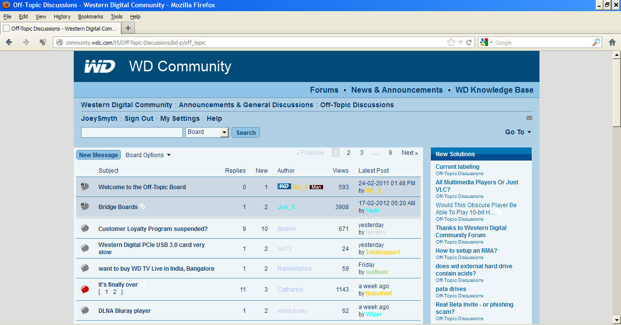
In the picture posted in the OP’s first message in this thread on page 1, take a look at “Bridge Boards” and you will see the white link icon next to the thread title. It shows up fine there as the thread is stickied and has a grey background. Now look further down on the picture for the thread titled “It’s finally over” There is an image icon next to the thread title but you can barely see it because of the color scheme.
Using white text on a pale blue almost white background or using yellow text on the same background (which I just saw in one of the replies) is absurd. People see by contrast first & color 2nd. I don’t care if this site was constructed by Lithium or the man in the moon! Someone was responsible for proofing it before release. PS…You can more easily read the white text if you put your nose on the screen.
Using white text on a pale blue almost white background or using yellow text on the same background (which I just saw in one of the replies) is absurd.
The text is BLACK on pale background. The responses above are hilighting what OLD posts look like in the re-skin.
And all original posts that WERE white on dark background are now black on light background, EXCEPT for people who specifically coded white text for some reason.
Using white text on a pale blue almost white background or using yellow text on the same background (which I just saw in one of the replies) is absurd. People see by contrast first & color 2nd. I don’t care if this site was constructed by Lithium or the man in the moon! Someone was responsible for proofing it before release. PS…You can more easily read the white text if you put your nose on the screen.
Hey, those are remnants of using font colors, and from the old background. If you see stuff like that pm me the link and I’ll fix them.
Also, I’ll be working on fixing all the small errant stuff. I had to wait till Lithium got off their freeze, which was yesterday.
[edit]
Thanks for clarifying, Tony. That is the case. However, if you guys see things that are off, let me know, cause I’ll be working on them this week.